The best marketing emails are enjoyable to read.

Ideally, subscribers look forward to receiving emails from your business, but if you’re not yet there, don’t worry; this goal is well within reach. You can get a strong response if you take advantage of the right resources while implementing email design best practices.
Email design is at the center of marketing success. It determines how much time recipients spend reading your email marketing messages and whether they absorb any of the information. Unfortunately, it can be difficult to master because email design can be very nuanced. The right design strategies will help you craft emails that get readers talking — and sharing.
Why is email design so important?
Email design determines whether recipients are compelled to read and engage with marketing messages. Effective design makes readers more inclined to take action.
A well-designed email has many positive effects, including:
- Building stronger connections
- Nurturing leads
- Getting readers to take action
To accomplish these tasks, a marketing email needs to:
- Grab attention
- Be enticing to read
- Touch upon readers’ emotions
- Reflect and reinforce your brand
Grab attention
Today’s customers receive a barrage of emails. From work to socializing, the most active inboxes are quickly filled.
A decade ago, McKinsey & Company ran an analysis of email habits, and the results were so surprising they’re still often quoted. According to that study, the average professional was spending a shocking 28% of the typical workweek managing emails. Since the onset of COVID, studies show that screen time is only increasing.
When inboxes are so packed, it’s easy to see why so many marketing emails feel so forgettable. The solution? You need a “Wow!” factor.
The cliche about a picture being worth a thousand words definitely applies. A visually distinct email will hook readers. They should be excited to continue reading instead of returning to check other emails.
A solid hook can sustain readers long enough to ensure that the email’s main message hits home. It will also increase the odds of keeping subscriptions current and open rates high. If clients or customers think you send lackluster emails, what will stop them from passing up your messages next time?
Be enticing to read
Once you’ve grabbed the recipient’s attention, you have a few short seconds to get the gist of your message across. The layout and aesthetics of your emails will either keep customers reading, or it will turn them away.
Distracted or overwhelmed readers will be quick to abandon your emails. The goal from the header on down should be to help them remain calm, focused, and entertained.
A growing body of research reveals that design has a huge impact on reading comprehension. For example, a 2021 study from Malmö University explains that typeface and spacing make their mark. Specifically, “manipulating the typeface of a text can, and most definitely will, affect reading comprehension, reading rate, and text perception.”
Touch upon readers’ emotions
Readers are more likely to connect with emails that deliver an emotional punch. And small details can create a meaningful reading experience. This is true even when readers cannot easily identify which elements produce the strongest feelings.
Color and font, in particular, set the tone. If these create a strong emotional response, customers are more likely to engage with the content. Photos can also evoke powerful emotions.
Even certain typefaces can influence readers’ feelings. Steve Jobs was well aware of this; his appreciation for awe-inspiring fonts ensured that they were featured with the original Mac. He later explained that in his early encounters with various fonts, he realized they could be “artistically subtle in a way that science can’t capture.”
Reflect and reinforce your brand
An effective email design should help you nurture leads and build stronger relationships with existing customers. Each email’s design should reflect and reinforce core brand values. It should also hold true to branding from other marketing initiatives, such as blogs or social media campaigns.
Today’s discerning consumers find design inconsistencies jarring. If these are glaring across multiple platforms, readers will struggle to trust your brand, and trust is vital to any strong customer-brand relationship.
Design can reassure customers that they’ve made the right choice in exploring — and eventually, committing to — your brand. Get them to trust your brand, and you’ll be rewarded with a new level of loyalty.
Email design best practices
It’s no secret that email design matters, but achieving an effective design is easier said than done. Targeted resources can bring the best of modern design to your email campaigns.
Professional email templates, for example, remove the guesswork so you can focus on developing content that helps customers connect. If you want to use your own design skills, take advantage of customizable templates with drag-and-drop editing opportunities.
Still need help? These design best practices should boost your email marketing results:
Build trust with the right sender name
Design email messages to inspire trust above all else. The simplest way to produce confidence is to optimize the sender name (also called the ‘from’ name). Not only can this remind readers who sent the email, but it may also be used to reinforce the subject line.
Above all else, the sender name must come across as authoritative. Today’s users are understandably wary of spam email, so they will shy away from anything that seems sketchy.
Many customers look at the sender name before they glance at the all-important subject line. Fail to capture their trust, and they’ll barely notice the subject line — and they’ll be reluctant to open your emails.
In addition to establishing trust, sender names can provide powerful opportunities for segmentation. These may be categorized by the intent of the email or the customer action that triggers it.
A straightforward message, for example, will appear to come directly from your business. If you prefer a more personal touch, however, the sender name could read as follows: “Brenda at The Awesome Company.”
The sender name will also influence brand awareness. This, in turn, determines if customers are willing to open your emails.
Optimize the subject line and pre-header
A solid subject line can draw in otherwise unenthusiastic email recipients. If you typically focus on developing a snappy phrase, beware. The intro message’s display is arguably just as important as the content it contains.
The best subject lines are clear, concise, and easy on the eyes. Aim for seven to nine words. This should be enough to convey the essence of the email without overwhelming the reader. Character count is just as important; strive for fewer than 50 characters.
As you experiment with subject line length and style, don’t forget about the oft-neglected pre-header. This summary text immediately follows the sender name and subject line when customers browse their inboxes.
The pre-header should support the content from your subject line and reinforce the call to action offered within the email. As with the subject line, it should be short and sweet.
Think of the subject line and pre-header as a powerful pair. These must appear cohesive and flow naturally to prevent earlier text from feeling awkward.
Seek opportunities for personalization
Build a stronger connection through the power of personalization. This should be present in every aspect of your emails, beginning with the sender’s name, which may include the name of a particular employee.
Personalization extends to the subject line, where the recipient’s name can be incorporated. Use purchase history or other data-driven clues to find ideas. The goal is to make the email personally meaningful to the reader.
Within each email, segmentation helps you reach specific types of customers. Segmented lists may be developed according to user demographics or other details.
Everything from the colors to the images and even typefaces can be adjusted to reflect what drives or inspires your target audience.
Build visual hierarchy into email layouts
Visual hierarchy is a central tenet of email design best practices. Under this approach, the most important information will be displayed first.
The reasoning behind this is simple: Readers’ attention spans are low even for the most impressively designed emails. As such, you need to convey essential details as quickly as possible.
If readers fail to get past the first few sentences, a strong visual hierarchy will help them benefit from the message’s main takeaways.
Several layouts can improve focus and comprehension. Top options include:
- Z pattern. Reflecting the natural route taken by the human eye when reading, the Z pattern is best reserved for emails with minimal text. A typical Z-pattern email will incorporate a zig-zag of content. This begins with text near the left upper corner. It then moves right, down in a diagonal, and again, to the right.
- F pattern. Another option that draws on insights from eye-tracking technology, the F pattern again relies on the upper left corner. This is where the reader’s eyes will naturally gravitate. From there, most people scan the upper portion of the email — the top line of the F, so to speak. This is followed by scanning down and then across. The further into the email readers get, the more time they’ll spend viewing the far left side.
- Inverted pyramid. Information-heavy content is best displayed in an inverted pyramid. This places the most important details at the top. This is followed by less fundamental text near the bottom of the page. This strategy has dominated mass media for decades. It remains a go-to solution for many modern email campaigns.
Keep mobile users happy with responsive design
As you seek the best possible layout, remember that most people will read messages on their smartphones or tablet devices. As such, responsive design is crucial.
This concept is simple; every email should reflect the environment in which it’s viewed. In a mobile-first world, this means adjusting layouts to work for smaller screens. Responsive emails should render properly no matter where or how they’re viewed.
Scrolling challenges should also be considered. Avoid horizontal scrolling whenever possible. Responsive emails should also keep vertical scrolling to a minimum. When in doubt, aim for single columns spanning between 600 and 650 pixels.
Size elements up or down to drive attention
Scaling plays heavily into modern email layouts, especially with mobile-first designs. The underlying concept is clear: Larger elements promise to attract the reader’s attention, especially when contrasted against smaller features. However, if too many elements are scaled up, none are likely to act as a focal point.
Template size matters. Best practices include a width of around 600 pixels and a height of approximately 1,500 pixels. Individual content blocks should not exceed 1,000 pixels.
With headers and footers, you may have more leeway. This will depend on the size of the images or the amount of text you intend to include.
Play with color
From the background to text to images, color plays into every aspect of your email design. The same can be said for lack of color. This could give your emails a clean, minimalist vibe but may also fail to capture the reader’s imagination.
Used correctly, color can function much like sizing: It draws the reader’s attention to areas you hope to emphasize. This is why bright colors are so frequently used for call to action (CTA) buttons. Without contrast, these prompts might get lost among the flashier elements of the email.
While bright colors can get readers to sit up and take notice, these must be used sparingly to prevent emails from appearing cluttered.
With minimalist designs, for example, white space may dominate. Meanwhile, a single bright color forces readers to shift their attention to a specific header or image. You can add a few extra colors, but opt for a limited palette when possible.
Color is one of the most important opportunities for establishing brand consistency. If you typically use a particular color scheme for social media updates or blog posts, stick to the same preferred palette for your emails.
Even so, there is some room for experimentation. This is especially true as the holidays approach. Colors that reflect upcoming special occasions feel more celebratory and personable.
Don’t forget about typeface
Your emails could ace sizing, colors, and layout but still feel cluttered or impersonal if they rely on the wrong typeface(s).
Some enthusiasts fawn over specific fonts, which they use anywhere and everywhere, but there is no single road to typeface success. The ideal typeface will reflect your brand’s values and avoid distracting the reader from the content of your message.
Often, well-designed emails incorporate more than one typeface. This draws attention to specific parts of the message.
Consider selecting one font for headers and another for meatier text. Key categories include:
- Serif. Many fonts incorporate extensions known as serifs. These typefaces are traditionally relied upon for print, although they often appear in emails with a lot of text. This look is classic and elegant. New York Times is the most recognizable serif font, but it’s just one of many. Avoid these typefaces for headers or call-out quotes.
- Sans-serif. These fonts are more frequently used for digital purposes than serifs. Familiar examples include Arial or Helvetica. These may be easier to read on mobile devices due to their lack of extra lines and swoops. These fonts hold a lot of contemporary appeal, falling clearly within the minimalist camp of web design.
Before you get excited about a unique typeface, keep in mind that it needs to be web-safe. In other words, the typeface should be compatible with a variety of email clients, such as Outlook or Google. Otherwise, it won’t display in your reader’s inbox as you intended.
Don’t forget to play with text sizing. Emails, like blog posts, should make full use of differently-sized headers to call out the most important content.
This approach works well with the inverted pyramid layout, as it draws attention to the most important messages from your email. Central takeaways should be summarized within the text of the header and then supported in the brief sentences or paragraphs to follow.
Optimize CTAs
The ultimate goal of your marketing emails should be to inspire action. A strong call to action provides the extra push that otherwise passive readers may require.
In a typical marketing email, this takes the form of a simple CTA button. You should strategically place this button and, when practical, feature it in a contrasting color. This button should contain a simple phrase or sentence that lets readers know which steps they should take next.
Confirm that CTAs are easy to locate. If customers can’t find them, the email will not generate the action you desire. For this reason, many marketing emails contain multiple CTAs dispersed throughout each message.
When you use several CTAs, their locations should reflect the natural progression of the content. Typically, this means placing a CTA near the bottom of each section. If the content successfully generates reader interest, each CTA will then be well-placed to help customers take the next step and click through to a strategically selected landing page.
Use high-quality images
Images add instant visual interest to your emails. They also provide a valuable opportunity to break up blocks of text. Depending on the circumstances, these could make emails feel more relevant or personable, particularly if they feature images of compelling products or services.
Every image should hold a clear purpose beyond simply breaking up the content. Aim for illustrative images which reinforce the information you’ve already presented in text.
Quality is essential, as today’s internet users are inundated with gorgeous photography daily. Because they’re so accustomed to stunning images, they’ll quickly take notice when pictures have higher compression or lower pixels than usual.
When in doubt, opt for one or two excellent photos rather than filling your email with lackluster pictures. Use images sparingly and strategically to deliver the greatest impact possible for each visual display.
Examples of email design best practices at work
Now that you know what goes into an effective email, it’s time to observe these email design best practices in action. Below are several examples of strategic email design at play.
As you’ll see, no one approach is ideal for every business when it comes to designing email; it’s all about pinpointing a strategic layout, aesthetic, and imagery that fits your brand.
Trader Joe’s
Specialty grocer Trader Joe’s has long been applauded for its Fearless Flyer, which customers eagerly anticipate. Trader Joe’s marketing emails are just as impactful, delivering the same cheeky humor customers have come to expect from their beloved flyers.
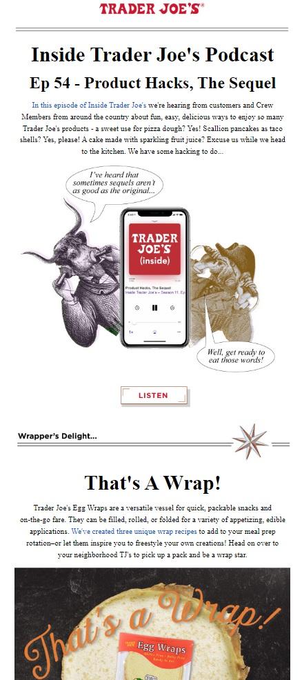
Each email prominently features the red Trader Joe’s logo near the top, plus a humorous header and eclectic artwork. These are surrounded by white space to draw your eye to the undeniably entertaining content. CTA buttons lead to the store’s podcast, product pages, and even recipes for enthusiastic readers to try.
Airbnb
With Airbnb marketing emails, evocative photography does all the talking. Short paragraphs and ample white space keep the reader’s focus on the real seller: the beautiful locations they dream of visiting — and the exciting activities they hope to partake in once they arrive.
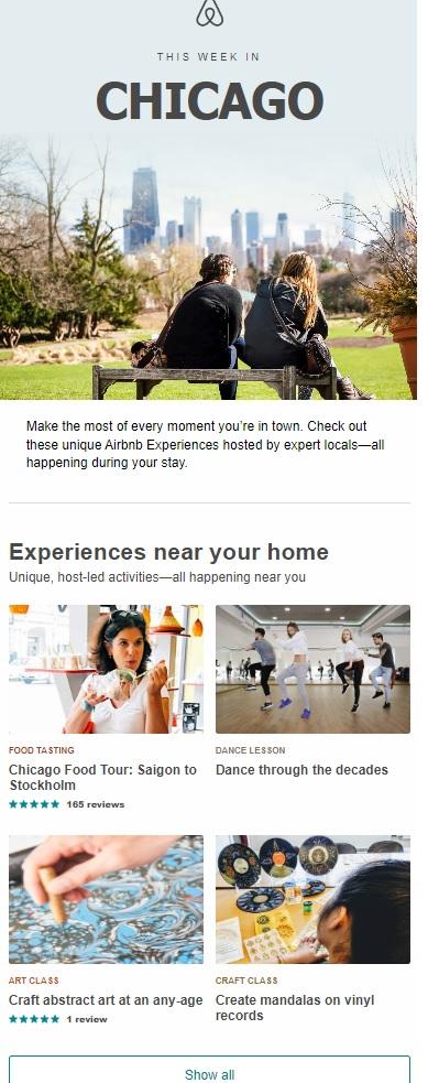
Airbnb also provides numerous examples of the power of email personalization. Many emails are triggered by recent search activity. To reflect this, they may include images of locations users have previously expressed interest in.
The subject line often includes the recipient’s first name. Meanwhile, prompts such as “still thinking about [location]?” remind would-be vacationers that they’ve indulged in Airbnb searches in the past.
Other emails focus on broad idea-sourcing to get readers inspired to plan their next getaway. In these emails, each short entry includes multiple photos and a brief sentence that bring the destination in question to life. Unique CTA buttons encourage readers to “Dream On” and check out the hottest listings.
Citi
Incorporating elements of the F layout, this email from Citi displays its most important information in a logo and header oriented to the left. What’s more, the email’s actionable steps can also be found on the left-hand side of the page.
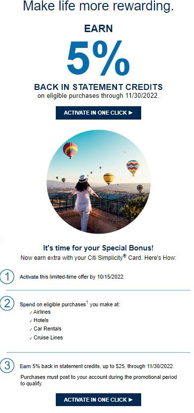
This information — combined with easily identifiable CTA buttons — reassures customers before they navigate the complex process of getting approved for a loan.
The most memorable component of the email? The large number 5 emblazoned near the top. Drawing attention to available statement credits, the number’s large size and contrasting color make it abundantly clear that cardholders stand to benefit from this deal.
Hardgraft
Bold images and a modified version of the Z layout make this email from lifestyle accessories brand Hardgraft impossible to forget. Instead of relying on text for its signature Z pattern, this email uses images of shoes to get the job done.
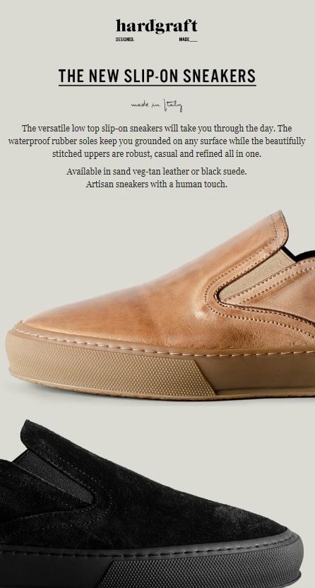
What’s more, Hardgraft’s email harnesses the power of the inverted pyramid for displaying its limited text. The most important information is presented first, followed by details about available colors.
Babylist
Offering another excellent example of the Z layout in action, Babylist uses a combination of zigzagging photos and chunks of text. This delivers undeniable visual appeal and keeps the reader scrolling.
To keep the screen from looking cluttered, the email sticks to what parents most want to see: adorable babies and helpful hints for how to interact with them at different stages of life.
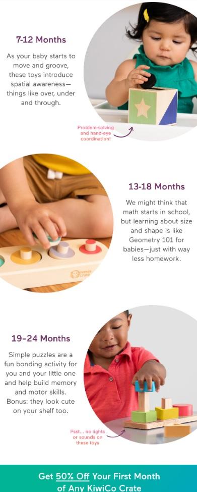
The CTA’s contrasting color somehow manages to drag the reader’s attention away from all those babies, announcing an excellent deal that both current and future parents will feel compelled to click.
Designing emails that get customers talking
Not just any attempt to design an email will cut it when you want to make a discernible impact on today’s busy consumers.
It’s your job to grab attention, share important information as quickly as possible, and build a stronger connection with your brand. Fulfill these email design best practices, and you’ll have customers clamoring to read every email.
Dive deeper: Get our guide on how to create the perfect email.


