
To me, branding is the most fun aspect of marketing. It’s the work of creating a coherent identity around a business that speaks to its values, mission, and goals. Branding is where your inner entrepreneur and your inner artist collaborate.
For smaller organizations, great branding is critical. You want customers to recognize you and build a relationship. A consistent and memorable presence fosters trust with and appeals to your target audience.
Whether you’re just getting started or have been in business for years, these small-business branding strategies will help you build a brand that lasts.
Why is small business branding crucial?
Small business branding impacts revenue, customer retention, and your position in a competitive market. Clever, consistent branding distinguishes a business and helps customers remember it and come back for more.
But what is a brand? Company branding involves more than just your logo, tagline, or the colors on your website (although all of these are relevant to branding for small businesses). Branding is the full character of your business and the personality, values, and experiences that set you apart from your competition.
In today’s saturated markets, standing out is more important than ever, and consistent brand presentation generates an average increase in revenue of 10-20%. Customers need to recognize and understand your brand to back it, transitioning from one-time buyers into loyal brand advocates.
Strategies for establishing your small business brand identity
There are many elements to small business branding, and they work together to create a clear brand. Use these 12 small business branding strategies together to ensure your brand stands out from the crowd.
1. Define your brand’s purpose
Your brand’s purpose is its guiding star — the meaningful “why” that guides what you do and how you do it. It also gives your customers a reason to support you. According to the golden circle theory, a popular branding strategy, the “why” must come first.
Reflect on your origins and values. Think about why your business came into being. What problem(s) were you trying to solve? What principles guided you as you evolved and will shape your actions in the future?
Craft a clear purpose statement that combines all these insights into a clear, compelling line about your business. It should be authentic and unique to your brand.
If you can distill your purpose statement into a good tagline, so much the better. Take LEGO, for example. Their purpose is to “inspire and develop the builders of tomorrow.” It’s easy to remember and short enough to display on any platform.
2. Identify your target market
Your target market is the group of people most likely to purchase your product or service.
A clear target market leads to better communication, improved product and service development, and increased customer satisfaction. Don’t try to be everything to everyone. Be something special to your ideal customer.
To define your target market, analyze your product or service. Who would it benefit or intrigue? Consider the following:
- Demographics (age, location, household composition, income, and identity groups)
- Firmographics (the business-to-business, or B2B, equivalent of demographics, i.e., industry, size, location, and performance)
- Psychographics (values, lifestyle, interests, and beliefs)
- Behavior (need or use for the product, benefits required, and brand loyalty)
Many businesses have more than one target customer. If you serve multiple markets, identify each, as well as the best channels you can use to connect with them.
3. Conduct a competitive analysis
Identify the businesses that offer similar products or services in your area — whether that’s a geographic locale or an online marketplace.
Competitors can be both direct (those who offer the same products or services) and indirect (those whose products or services could substitute for yours). For instance, if you’re a local bakery, your direct competitors might be other bakeries, while a grocery store selling baked goods could be an indirect competitor.
Once you’ve identified your competitors, it’s time to gather data. Take a look at their:
- Products and services: What do they offer? How do their prices compare to yours?
- Marketing strategies: How do they promote their business? What channels do they use?
- Customer reviews: What do customers like about them? What are their common complaints?
Look for patterns and trends. What are their strengths and weaknesses? What opportunities can you capitalize on? For example, if customers complain about slow service at a competitor’s business, you could highlight your quick service as a selling point.
4. Develop a memorable brand name
Your brand name is more than just a word or phrase. A memorable brand name can set you apart from the crowd, evoke positive emotions, and build customer loyalty.
Consider your mission, core values, and unique characteristics, as well as a few branding tips for small businesses:
- Less is more. You want something easy to say and remember.
- Personality is key. Play around with your brand name until it has a distinct look and sound.
- Inspiration can come from anywhere. Have fun with your brainstorming process. Iconic brand names often stem from unlikely combinations.
Before you settle on a name, test it out with potential customers. They may hear something you don’t. For example, more than one major business has encountered problematic translations when serving a multilingual crowd. Irish Mist liqueur probably should have steered clear of the word “mist,” which means dung in German, if they wanted to sell well in Germany.
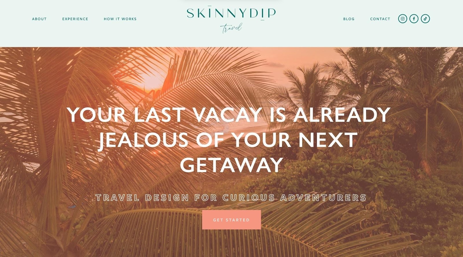
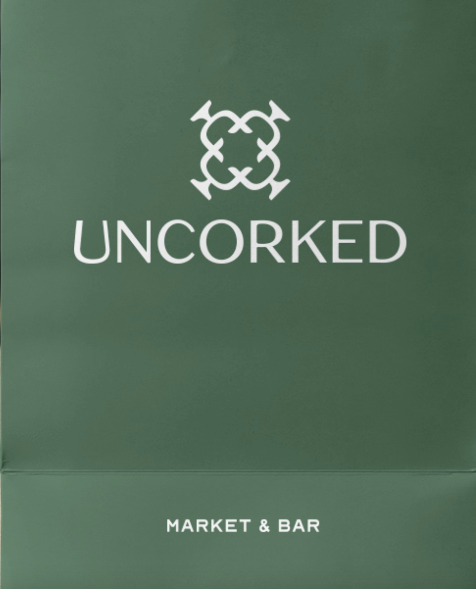
5. Design a compelling logo
A logo is the most visible element of your company branding. It’s often the first thing people notice about your business, which is crucial in shaping their perceptions.
Creating a compelling logo involves striking a balance between aesthetics and meaning. You want it to look good and suggest a connection or evoke an emotion.
A business owner looking for a strong brand logo should prioritize simplicity and versatility. You want an uncomplicated design that looks good wherever it appears.
A logo should also be relevant but not necessarily literal. Don’t underestimate the power of simple shapes.
6. Maintain a consistent brand voice
Brand voice refers to the personality and emotion infused into a company’s communications. It’s how you converse with your customers and give them a coherent persona with which to connect.
Consider your company’s mission and target audience. For instance, technical branding might require a confident and innovative voice to persuade tech consumers to pay attention to the business.
One tip is to identify three adjectives that describe your voice. If you create too long a catalog of characteristics, you risk losing clarity and diluting your voice.
When developing a brand identity, consistency is key. Make sure all involved understand and can apply your brand voice.
7. Design a cohesive visual identity
A visual identity is the visual aspect of branding businesses create to evoke certain feelings and experiences with the brand. In addition to the logo, a brand’s visual identity includes typography, color scheme, imagery, and typical layouts.
Typography
Choose fonts that suit your tone and message. An insurance company might opt for a sleek, modern font, while a toy store might prefer something playful and fun. Remember to choose easy-to-read fonts to allow your audience to engage with your text.
Color Scheme
Think about color psychology. What emotions and associations do you want your color palette to evoke? Would a trustworthy blue, creative purple, or cheerful yellow better serve your purpose?
Imagery
The style and quality of the images you use matter. Wedding planners often gravitate toward glossy, romantic photos, while a tutoring business might opt for simple, two-dimensional illustrations.
Layouts
Your typical layouts should reflect your brand’s style, too. For example, you could use the same structure for all brochures, prioritize white space, or use collages on social media.
8. Create a brand style guide
A brand style guide is a framework that outlines many of the above visual elements. It’s an easy reference to foster consistency across all platforms, enhancing your brand’s credibility and recognition. Imagine the confusion if Coca-Cola suddenly started using green instead of its iconic red!
Clear guidelines also enable you to work with a team or outsource some of your marketing materials. Identify the appropriate tone for content and get everyone to use the same basic elements. You can also establish rules for formatting and research. What sources do you want writers to link in a blog post? What should they avoid?
Pro tip: Take advantage of brand board templates. For example, Canva offers plenty of free tools to make brand consistency easier.
You also want to revisit your brand style guide periodically. It’s a living document that should grow and evolve with your brand.


