
What’s the point of having a website if it sends visitors bouncing away within moments of their arrival? Much of the world takes place online these days, and an amateurish site suggests to consumers that either you’re out of touch or you just don’t care. So, yes, it is essential to create the best nutrition website for your brand.
But what does the best nutrition website even look like? Not to worry — we’ve rounded up some truly great examples. Because sometimes all you need is a little inspiration.
What makes the best nutrition website?
The truth is that beautiful and effective web design can take many forms — as you’ll see below. Though there are a few non-negotiables for a nutritionist website.
Quick and mobile-responsive
You absolutely must cross your technological t’s and dot your internet i’s. The easiest way to lose viewers is by making them wait ages for your site to load. If you aren’t using a strong website builder, be on the lookout for extra code or anything else that could slow or disrupt the site.
Your website should also be mobile-responsive. Don’t force visitors to drag around cell screens in order to see your content. The site needs to be beautiful and easy to navigate on mobile devices.
After all, 56% of internet traffic happens through mobile devices, and that number is only on the rise.
Clean, clear, and true to your brand
Web visitors should never have any trouble finding the information they need. Be clear about who you are and what you offer — both in your explicit information and in your health business branding.
Set up to capture email
Email is still the best marketing channel. It returns $42 for every dollar spent. If you haven’t designed your website to capture email addresses and take advantage of email marketing, you’re missing out on your best opportunity.
Full of valuable content
Blogs, videos, ebooks, recipes, links to other resources — all of the example websites below offer visitors a good reason to stick around.
Add video to your website. Or add a blog so you can cover a range of health and wellness topics.
The Hormone Dietician
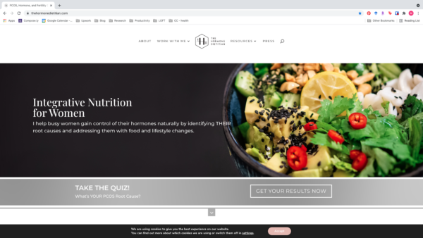
The Hormone Dietician (aka Melissa Groves Azzaro) distinguishes itself immediately. The site is clean, focused, and mature — without being stodgy. The visuals are lush and spare, designed to appeal to the adult audience that is Azzaro’s target market.
Moreover, it’s hard to imagine a clearer statement of purpose than the homepage copy of this nutrition website:
“I help busy women gain control of their hormones naturally by identifying their root causes and addressing them with food and lifestyle changes.”
To break it down:
- Busy women…hormones. This is the clientele — successful career women who are either having children later in life or approaching menopause.
- Gain control of their hormones naturally. This is the promise.
- Identifying their root causes and addressing them with food and lifestyle changes. This is the method.
You know exactly who Azzaro serves and how. It’s the work of a second to decide whether or not you fit her profile, and that instantaneous choice on the visitor’s part guarantees Azzaro more promising leads than a vague offer of healthy eating tips.
Colleen Webb Nutrition
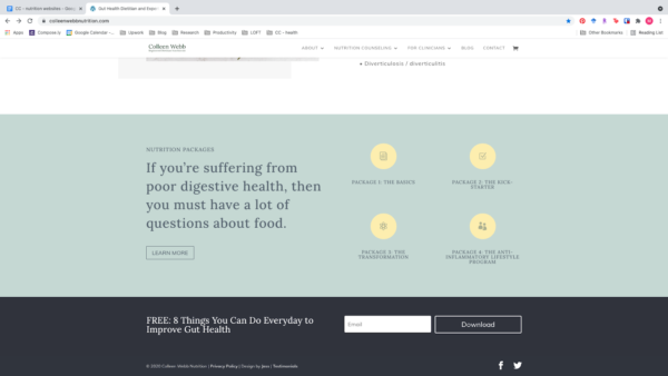
Similar to Azzaro’s, Colleen Webb’s website immediately establishes its identity. While Azzaro’s homepage characterizes her clientele, Webb’s homepage focuses on her expertise and approach.
Instead of a picture of food, she has a picture of herself, and you can scroll down to find notable media outlets that have featured her. Her mission is as clear as Azzaro’s — but centered on the gut rather than on hormones.
However, where Webb really sets herself apart is in the clarity she brings to her packages. Scroll down the short homepage and you find a clear list of her services. When you click on any one of them, you get details and prices.
Don’t shy away from clarity about prices. If someone is going to experience sticker shock, that’ll happen regardless of when they hear them.
People just want to know what things cost. So tell them.
Summer Tomato
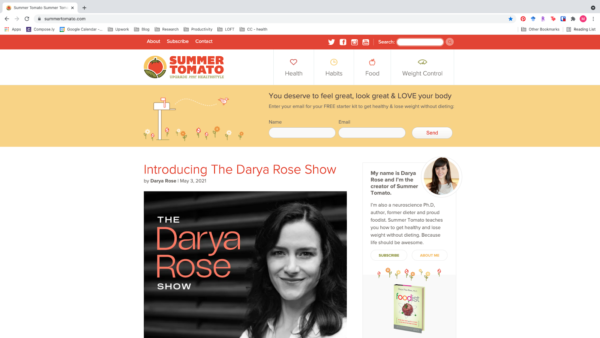
Darya Rose of Summer Tomato gives her visitors multiple ways to connect right from the top of her homepage. For one thing, all of her social media accounts are cleanly laid out in the header.
More importantly, before anything else, Rose gives you the opportunity to sign up for her email list — and offers you something free if you do.
Create something that your audience wants and use it to entice them to share their email address with you.
Kris Carr
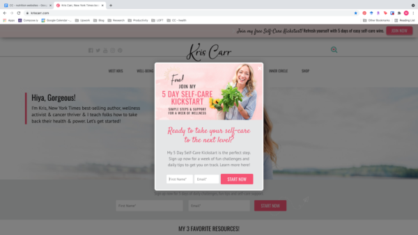
While you should have a stable form on your site, a popup is another great way to get email contacts. Kris Carr blends sass and heart throughout her site — and her popup is no exception.
Add a popup with a plugin in order to remind visitors to sign up for your email list and create the best nutrition website you can.
In addition, everything about this site shouts its positivity. Kris Carr isn’t just a cancer survivor — she’s a cancer “thriver.” The images and colors of the site are full of joy. It’s a great example of how all the details of a site can contribute to its brand.
First Step Nutrition
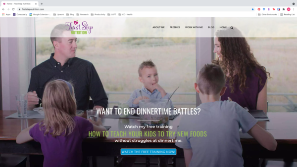
Jennifer House of First Step Nutrition takes a different approach to appeal to a different audience but still delivers one of the best nutrition websites.
House directs herself to busy parents. Her site is image-rich and text-light. Continuing the theme, she foregrounds her nutrition videos, easy-to-consume content that parents can watch out of the corner of their eye while wrangling little ones.
Video content rules supreme in 2021. People spend a third of their internet time watching videos. Tap into that appetite with tasty — and nutritious — videos.
The Doc’s Kitchen
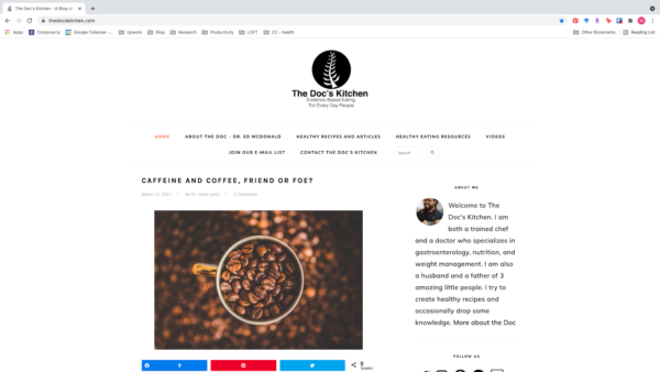
When you enter The Doc’s Kitchen, you’re perfectly in control, ready to select from a tantalizing array of content. Dr. Ed McDonald offers up recipes, articles, videos, and links to other resources — in addition to the basic About, Contact, and Sign-up pages.
Why doesn’t it come across as crowded? Negative space. McDonald spreads out his content. He even adds extra spaces between the items in the navigation menu, which would otherwise be too cramped.
As much as you want to include everything — and you want people to see it all — keep your website clutter-free and easy to navigate.
Use the best tools to create the best nutritionist website
You now have an array of high-quality websites from which you can draw inspiration as you craft the best nutrition website you can. Find the right style to suit your brand and message, and go from there. You don’t need to have experience in web design to make a great website. All you need is a good tool.


