
First, the good news. There’s no need for advanced web design or coding skills to master the art of landing page design.
A landing page is a standalone web page created specifically for a marketing or advertising campaign. It’s where a visitor “lands” after clicking on an advertisement or other call to action (CTA).
Think of a well-constructed landing page as the beginning of a beautiful friendship between you and your target audience. You want users to find essential information quickly but still leave them wanting more. They should be eager to sign up for email lists or explore your website.
Here’s how to craft an effective landing page design to get your new relationship off on the right foot.
Why a good landing page design is important
A well-designed landing page directs traffic, engages prospects, and drives conversions. It also helps you track campaign metrics for channels leading to it.
A landing page is the first thing visitors see when they click on an ad or link, so ensuring your landing page is designed to encourage visitors to take action is vital. This could be signing up for a newsletter, downloading an ebook, or purchasing.
Landing pages have a 160% higher conversion rate than the sign-up tool with the next highest rate. But results aren’t guaranteed, and a good design is essential for success.
How to design a landing page
Because landing page design is so important, creating the best design possible is crucial. And the good news is that you can turn your landing page into the high-converting tool it can be with a few best practices.
Essential elements of a landing page
A good landing page should be lean. More people go wrong by adding too much than too little. All you really need are these five essential elements, the fundamentals of what makes a good landing page.
1. What
Explain what you offer. Focus on one service or product per landing page and make it clear — easy to find and understand. A catchy headline never hurts, either.
2. Why
Tell your audience why they should choose you over your competitors. Talk about the value you provide. You might highlight convenience, cost savings, novelty, quality, or other critical aspects of your product or service.
Ideally, you should present visitors with your unique selling proposition (USP), a clear, concise statement about what makes your product or service the best option.
3. Call to action (CTA)
Your goal should be clear when designing a landing page — what do you want visitors to do once they land on this particular web page? Whether it’s signing up for a newsletter or buying something from you online, make sure there is only one CTA so that there is no confusion about what you want them to do next once they land there.
Call focus to your CTA visually, making it stand out on the page. It’s also a good idea to make the desired action easy to complete. Let page visitors click on a button or enter their email addresses. The easier you make the task, the more likely they are to complete it.
4. Compelling visuals
The old cliché — that a picture is worth a thousand words — has its place in landing page design. You want to communicate with users as efficiently as possible. Strong visuals can do more than add appeal. They can clarify your message and value proposition.
Hero images or videos, which draw visitors in, are critical. A good hero image is relevant to your product or service, eye-catching, and engaging. Avoid stock images that don’t add any value.
5. Proof
This could include social proof, such as customer reviews, ratings, or pictures. But you could also introduce awards won by your company or impressive statistics. The important thing is to build the visitor’s confidence in your brand and whatever you sell.
Again, be concise. Instead of pasting in the full review, pull out a couple of key phrases or point to a five-star profile on Google, perhaps including a logo for an award you have won.
Design principles
Consider a few design principles as you put your landing page together. These are good practices for any web design, but the compressed space of a landing page makes them extra important.
Make information easy to scan
Organize important information to make it easier for visitors to scan. A few tips to improve scannability are to:
- Use headings where appropriate.
- Break up text into short chunks.
- Use colors that are easy on the eyes.
Some of the same principles for accessible design also make good landing page design ideas. Good color contrast and fonts that are easy to read (such as Verdana or Arial) make everyone happy.

Think about flow
How people read web pages has changed over time, so staying current with the trends is essential. Try laying out your page in F-shaped or Z-shaped patterns. But the most important thing is to keep the viewer’s eye moving where you want it to go. Sections should flow into one another.
Maintain branding
Your landing page should reflect your brand identity, creating a consistent visitor experience across channels. Use colors, fonts, logos, and other visual elements that match those used on your website and other marketing materials.
Use A/B testing
A/B testing is an excellent way of understanding what design and content work best for your page. It’s a great tool for optimizing user experience and conversion rates.
Find out what resonates most with your target audience and adjust as necessary. You’ll also get information to shape successful marketing campaigns down the line.
Optimize for mobile
Consider how the page will look on different devices, and create a responsive design. If necessary, you can use landing page tools to edit the mobile version to work on multiple device types.
Avoid landing-page don’ts
There are also some errors you should avoid in creating your landing page.
- Don’t ask for too much information. Ask only for the information you need. Progressive profiling can fill in more customer information in later interactions.
- Don’t clutter your landing page. There’s no need to list every feature of your brand or product. Too much information will overwhelm prospects. Instead, highlight a few key benefits for potential customers.
- Don’t rely on stock images. Using real images of people or products will help you make your point and create more of a connection with visitors.
- Don’t include a bunch of links that direct away from the landing page. This will distract visitors from your main offer and reduce their chances of converting.
- Don’t forget about search engine optimization (SEO). It’s as important to optimize your landing page as it is any other web page. Get seen by the right people at the right time — when they’re actively looking for what you offer.
Landing page tools
When it comes to designing your landing page, you have several options. Many popular website builders offer easy-to-use tools to create custom pages with drag-and-drop elements. Constant Contact also offers the ability to build landing pages.
You can also use specialized landing page software, but those can be expensive, so they aren’t for small businesses that only create a few landing pages a year. But if landing pages are a significant part of your digital strategy, it may be worth the investment.
Some of the best landing page builders are:
Landing page design examples
A picture’s worth a thousand words, so here are some examples of highly effective landing page design.
These best landing page designs belong to various industries and take different approaches. As such, you’re sure to find one that can serve as inspiration for your next campaign.
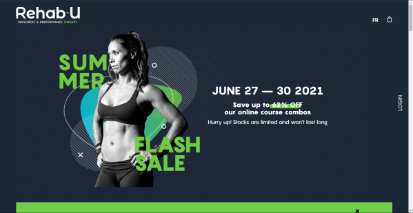
Rehab-U
Rehab-U directed people intrigued by a Facebook ad to this landing page, advertising a summer flash sale on its training programs.
Visually, the page makes good use of Rehab-U’s brand elements. The design is bold but clean. But its real strength lies in the efficiently communicated offer and urgent CTA.
Nothing at the top of the page distracts from the numbers — the ticking clock and the large discount.
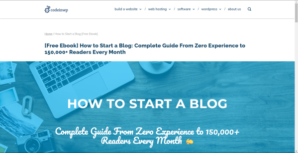
CodeinWP
CodeinWP, a WordPress-focused brand, shows how you can use your landing page in conjunction with a lead magnet, such as an ebook.
As you scroll down the page, CodeinWP tells a short story about the authors’ success. They are proof that the strategies outlined in the book can work. The approach is conversational but succinct and fits the brand nicely.
Paramount+
If you’re in the business of great content, take a cue from mega-weight Paramount+. Your content might not be as highly produced, but you can still run one of your videos or a reel of images.
But don’t distract your viewers with unnecessary text. Paramount+ keeps the text to a minimum, letting its content sell the free trial it’s promoting.

Dreamforce
Dreamforce sets up a landing page to promote its annual convention well before the event. Tickets aren’t even available yet, but visitors are encouraged to mark their calendars and sign up for future updates.
It’s a good reminder that a landing page design can be fluid. Dreamforce’s CTA and content will change as the event approaches, as the brand tries to move tickets.

Codecademy
Codecademy demonstrates the power of a strong hero image on its landing page. Non-stock pictures of people — particularly ones that show the face — draw viewers into a site, increasing their connection with a brand. The landing page design carries the theme further down the page, featuring a “Stories from real people” gallery, each with a profile shot.

Blue Apron
This is another massive brand with a stealable landing page strategy. Blue Apron’s landing page relies on pictures of its product and a strong tagline.
If you’ve got it, flaunt it. Establishments like restaurants and some retail stores can showcase their offerings to a powerful effect.
As for the tagline, Blue Apron communicates a lot in a few words: “A good meal changes everything.” The brand is all about the marriage of convenience and quality. It reminds you of the value of home-cooked food and promises to make the experience happen for you.

NextDraft
And finally, the ultimate minimalist landing page. NextDraft comes up with its own answer to the question, “What is a landing page?” The answer: as little as possible.
This invitation to subscribe works because it’s so daringly spare. Everything is white space except for the CTA, “Subscribe to the NextDraft newsletter,” and the offer, “Real News Daily, In Your Inbox.”
The no-nonsense approach is on brand and strong. In part, it communicates through what it dares to leave out.

Come in for a landing
There you have it, multiple ways to nail your landing page design. Keep the layout clear, focused, clutter-free, and on-brand. The content should present your offer and prove its value.
The first step is to identify your landing page’s primary objective. Think about if your goal is to promote an event or a product. Maybe your aim is to grow your list with more signups and downloads.
Once you know your CTA, you can shape your page around it. And remember that you can always refine the landing page as the campaign progresses.


