
Nowadays, running a nonprofit organization goes beyond just having a passion for impacting disadvantaged people’s lives and raising funds to support your cause. Whether it’s a social or animal welfare organization or an educational organization, establishing your nonprofit into a unique brand will boost its recognition and credibility.
A brand’s visual identity — signified by logos, ad graphics, etc. — plays a huge role in the success of its marketing strategies. But, the purpose of having a nonprofit logo is not just to show off to your target audience (and competitors) that you have a world-class graphic designer on your team.
Your nonprofit logo acts as the face of your brand across several marketing channels. With a well-designed logo, you can communicate your nonprofit organization’s mission and values to your target audience with just a glance.
Imagine getting a call or a text from a potential sponsor who reached out to you after they came across your organization’s logo while scrolling through Facebook. Sounds great, right?
However, well-designed logos don’t come cheap and usually cost between $2,500 and $10,000 for a professionally designed piece. Expecting a nonprofit that generates about $20,000 in annual revenue to whip out that amount of cash for a professional logo design is unrealistic.
What makes a good nonprofit logo
The truth is, unless you’re an internationally recognized brand, your logo might act as the first point of contact a prospective donor or a volunteer has with your nonprofit. Today, the possibilities of your target audience discovering your nonprofit organization through your logo (or other visual identifiers) are endless — whether it be a shared social media post, a search engine image results, or something else.
For your nonprofit organization to engage this audience type, you will need a uniquely designed logo. And, contrary to popular belief, it’ll take more than aesthetics to capture your audience’s attention.
In fact, using a vague — but aesthetic — graphic as your logo might capture your audience’s attention. But they’ll be on their way out the moment they’re done admiring it. Below are a few design ideas you may want to keep in mind when designing your logo.
A good logo is well-detailed with relevant elements
The number one goal of a logo is to help prospects visualize your brand’s identity. Adding relevant elements to your logo might help your target audience better understand what your nonprofit organization is all about.
Say, for example, you’re in the market for a new espresso machine. You’ve spent hours browsing through Google’s results pages but still haven’t decided on which one to buy.
But, when you head over to Facebook to check updates from your favorite business page and then scroll through your feed, Facebook’s algorithm suggests a few business pages for you to follow based on your previous web activity.
One brand’s display picture spotlights a wordmark logo that reads “Josh’s,” while another’s logo features a perfect blend of wordmarks and relevant symbols related to espresso machines.
Which one are you most likely to follow? Chances are you’ll even end up purchasing from the latter after following their business page — even if, in reality, Josh’s espresso machines are more durable and of higher quality.
“Josh’s” as a standalone element in a logo doesn’t exactly describe or represent the brand’s products or services. You want to make sure your nonprofit’s logo is as detailed as possible, utilizing relevant elements to communicate your organization’s mission.
Not everyone will take the time to find out more about your brand after stumbling upon a visual identifier on social media.
A good logo should be as simple as possible
Just because your nonprofit logo has to be well-detailed doesn’t mean it has to include a lengthy description, a section dedicated to reviews and testimonies, and pictures of volunteers from different races that showcase your brand’s diversity.
Think of creative ways to express your nonprofit’s identity in as few elements as possible. If you’re not open to the idea of modifying your brand name, including a short but catchy slogan or adding a highly relevant symbol to your logo will help convey your nonprofit’s values to your target audience.
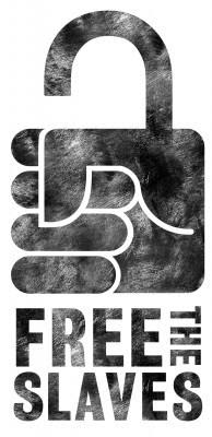
To better illustrate this idea, take a look at FreeTheSlaves’ logo, a nonprofit organization dedicated to combatting modern slavery and trafficking in vulnerable communities. See how their brand name and symbol — a fist designed to look like an unfastened padlock — clearly expresses the organization’s values in a simple design.
A good logo is memorable
If your nonprofit is going to stand the test of time, it’s going to need a memorable logo. Creating a unique and simple logo that communicates your organization’s values to your target audience will etch your brand’s identity in your visitors’ minds.
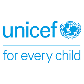
A perfect example of a memorable logo would be UNICEF’s. Recognized worldwide as a social welfare organization aimed at defending children’s rights, the fund’s simple two-color themed logo features the brand name, a symbol of a mother holding up her child, with the slogan “for every child” below the name and symbol.
A simple, well-detailed logo design that symbolizes your brand’s identity will remain fresh on your audience’s mind for years to come.
Good logos communicate consistent and timeless brand messages
There’s a common misconception about how specific properties make up timeless logos. For example, you often hear graphic designers urging people not to go for trendy designs when creating their logos. Timeless designs have a higher chance of communicating your brand’s mission over the long term than trendy designs.
This wrong misconception shouldn’t make you worry about all the elements you need to include in your nonprofit logo to make it perfect. Instead of stressing on how to create a timeless design, why not focus all that energy on creating a consistent and timeless message that conveys your nonprofit’s essence?
Let’s refer back to the UNICEF logo. In the 75 years of its existence, the charitable organization has modified its logo nine times.
If you’re reading this, there’s a good chance three out of those nine modifications were made after you’ve familiarized yourself with the NGO. Maybe UNICEF is not as recognized as, say, Pepsi. But, have you noticed the tweaks Pepsi made to its logo in 2014?
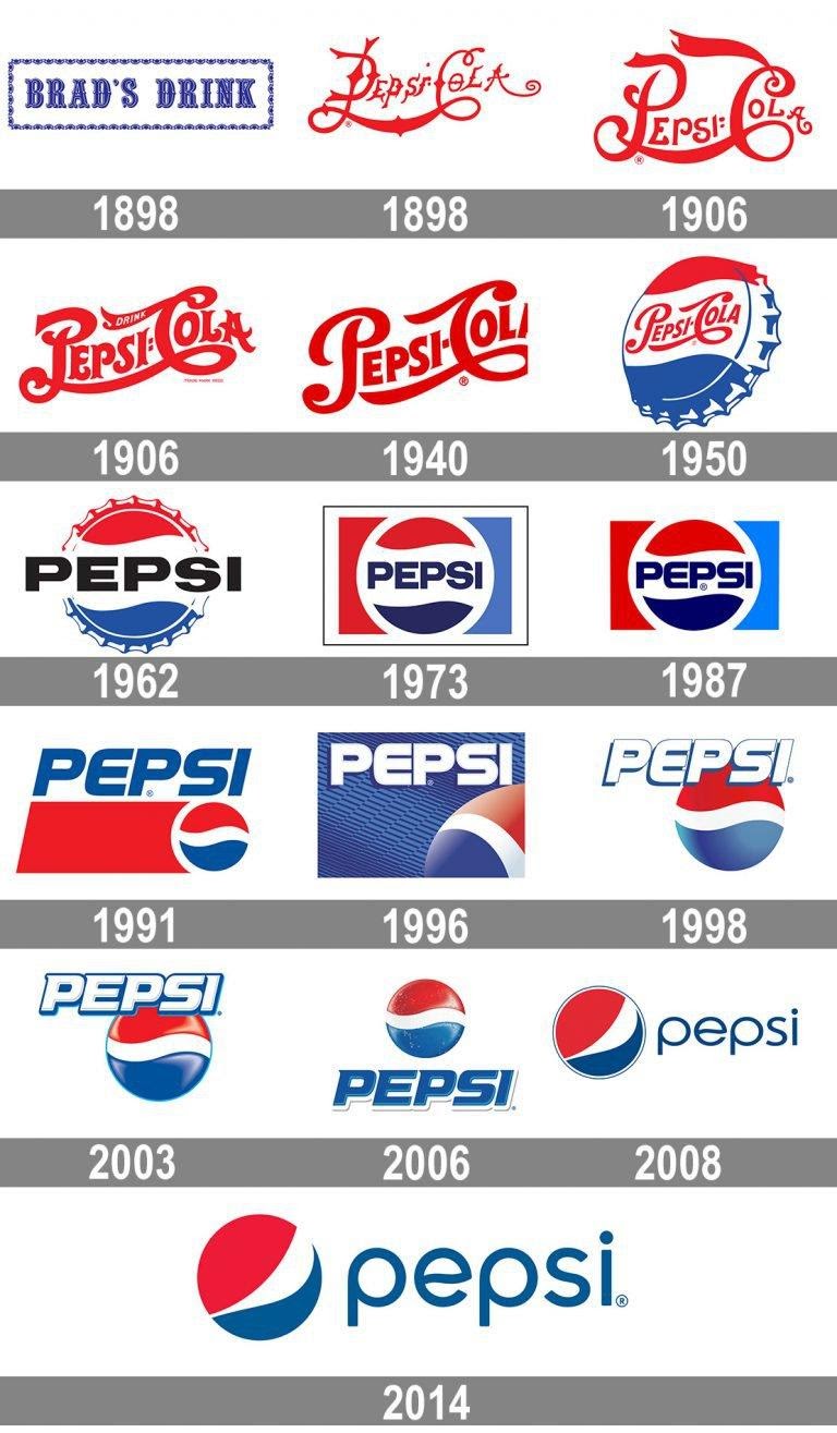
Some of the tweaks, you may have noticed, but some, you may not have — especially the one made very recently. This is because regardless of the element the company decided to include in its logo, its brand still retains its colors — the same colors that have defined the brand since 1950.
Instead of brainstorming timeless design ideas that best symbolize your brand’s identity, you should look to communicate your nonprofit’s mission through whatever visual identifier you’ll be using.
Focus on brainstorming consistent ways to convey a message instead of a timeless design to convey the message. This way, you can modify your timeless message into as many designs as possible without your audience even noticing.
How to create a nonprofit logo
Now that you’ve learned what a good nonprofit logo looks like, it’s time to create one. The guidelines listed below should assist you in selecting the right elements for your nonprofit logo.
Name
George Eastman, the founder of Kodak camera, said, “A trademark should be short, vigorous, incapable of being misspelled.”
Have you decided on a brand name yet? If you haven’t, keep in mind that there’s no such thing as a “perfect brand name.” It really doesn’t matter whether or not your nonprofit’s name reflects its essence. It can be a name — your name — or a combination of names.
As long as your nonprofit’s name is bold, pronounceable, and memorable, it’ll draw people’s attention. This is an aspect of logo design often overlooked by designers. If people have to strain their eyes to read the text in your logo, it’s high time you considered a redesign.
Another thing to remember when designing your brand name is simplicity. Order your words properly so that your logo isn’t entirely drowned in text. Even if your nonprofit’s name is long, you can shorten it to include only initials — like what the World Wildlife Fund, abbreviated as WWF, has done.

Slogan
If you missed communicating your nonprofit’s mission in your brand name, a slogan provides the perfect opportunity to establish a connection with your target audience. Your slogan is one element in your logo that you must get right.
In as few words as possible, you want to communicate your charitable organization’s core mission and values. You want to make sure that every time someone sees your logo, they can envision what your brand is all about.
Remember that your logo is not an ecommerce website, so it doesn’t need a product description. Drowning your logo in lines of text isn’t going to make it more appealing.
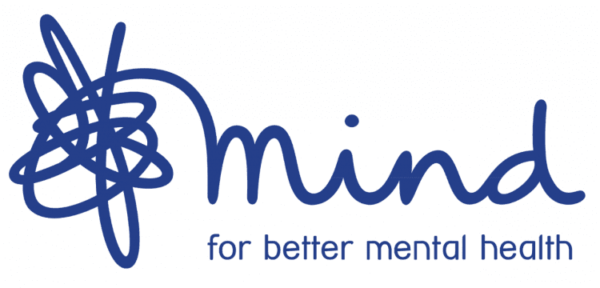
Mind’s “…for better mental health” slogan vividly communicates the NGO’s mission — extending support to people experiencing mental problems.
Symbol
Your logo’s symbol or icon may be the first thing people notice when they look at your logo. That said, including a highly relevant visual element — that symbolizes your organization’s identity — as your symbol is guaranteed to help promote engagement.
Including symbols in your logo is dependent on how creative you are because whatever symbol you decide to add to your logo has to identify with your brand’s personality. If you can’t think of any original ideas for a symbol, don’t worry. There are so many recognized brands out there that don’t include symbols in their logos.
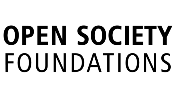
An example of a nonprofit organization without a symbol in its logo is Open Society Foundations, geared toward providing grants to independent groups advocating for human rights, democratic governance, and justice. In its logo, Open Society Foundations has taken a very minimalist approach with its text-only logo design.
Colors
Adding colors to your logo might not seem really important or even appear counterintuitive to you, but these colors can play a key role in establishing your brand’s visual identity.
For example, if you see a Facebook ad of Amnesty International, chances are you may not immediately recognize the logo used by the organization.
What you may recognize, though, is the ad’s main color theme: black on yellow. That, coupled with the message conveyed in the ad, makes it clear who the advertisement is for.
Shape
The shape of your logo’s background — or its boundary — may not be an initial consideration, but if you feel creative, or like the look of emblem style logos, try different shapes to house your logo.
Final thoughts
Here’s the thing, creating a great logo for your nonprofit organization isn’t as hard as you think. Once you’ve identified your target audience, try to see things from their perspective: what are they most likely to associate with a brand?
A simple, well-detailed logo design that symbolizes your brand’s identity will remain fresh on your audience’s mind for years to come.
If all this sounds overwhelming, don’t worry, you can use a logo maker to design a unique and memorable logo for your nonprofit organization. All you have to do is input a brand name. The logo maker’s AI then browses through hundreds of relevant symbols and generates several well-designed ideas for you to pick from. From there, all you have to do is choose the one you feel best expresses your brand’s personality.


