
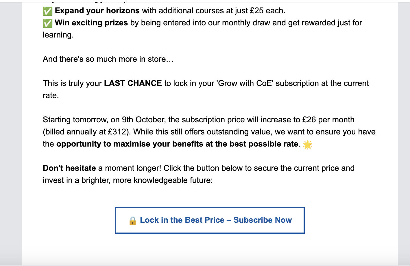
Sometimes, the sale is literally one click away. Like the other week, I received an email with an offer for tickets to see an orchestral performance. There was a bright green button that read: Get Your Tickets Now. It was clear what to do. I clicked, made the purchase, and my night of culture was on the books.
It’s the kind of straightforward action business owners want every recipient of their emails to do. To make it happen, it starts with a straightforward call to action, or CTA for short. In every piece of marketing material, you need to have a very clear phrase that lets the reader know exactly what you hope they’ll do next. That’s what a CTA is. You’ve seen them, and, like me, you’ve probably clicked on them, too.
CTAs work best when you use active language that gives people like me a gentle push toward the beginning of a customer journey with you. If you worry that you’re being forward, think of how easy it was for me to say yes to those tickets.
Once they’ve subscribed, people want to hear from your company. Constant Contact’s email statistics show that 55% of consumers say that email is the preferred digital channel for connecting with their favorite businesses. What’s more, 34% of customers who receive your emails are more likely to purchase your goods or services after receiving a direct message from you.
They’ll begin the customer journey through the CTA, which works best with the simple option “add button to email.” If you have never added CTA buttons to your emails before, get ready to see how easy and effective the process is.
What exactly are email buttons?
An email button is a small, clickable, and often colorful shape that has a small amount of text on top that can be added to an email message using certain email marketing software.
The button itself is created with code that, thankfully, neither you nor I need to know much about. That’s one reason why investing in email marketing platforms like Constant Contact is worth it. You don’t get this option when you send business emails with Microsoft Outlook, Google email, or other platforms designed for personal use.
This clickable button is a bright, obvious call to action. You can add buttons to email messages to make sure the reader is clear on the next step in the journey. Then, there’s no confusion about whether any underlined font is a link or not —with a button, you know. The clarity is in its simplicity.
These email CTA buttons can come in a bunch of shapes, although the rectangle and oval are the classic options. You can also choose any color in the rainbow for the button’s background color. You can set up any link for the button to navigate the reader onward.
These can be different for every email you send, or you can choose one style and use it as part of your branding. There are many benefits of knowing how to add a button to emails.
The benefits of using email buttons
It’s one thing to know how to create a welcome email. Adding the buttons to enhance your direct email messages is another thing. If you haven’t done it before simply because it seemed like too much work to figure out, let’s start by giving you some motivation to add your first call-to-action button.
They are visually appealing and attention-grabbing
The best thing about email buttons is that they jump out at you on the screen. No, they’re not three-dimensional, but they are dynamic content designed to get your attention. Because the text on the button is framed in a color that’s different from the rest of the email template, you’re using the power of graphic design to draw the eye where you want it.
But you also don’t have to limit yourself to a single color as the background. For example, you can use PicMonkey, which is a photo-editing tool available through the Constant Contact platform, to create a mobile-friendly button from an image. You simply type the text over the photo, and voilà! Any photo in your library on the platform can be made into a button.
They are clear and concise
If you want your email template design to look good, the buttons can’t be too big. The button size will automatically increase or decrease with the amount of text and font size. The more focused you are when writing your call-to-action text over the entire button, the better.
While that might be a challenge, it will result in a clear and concise action button that gets clicks. This goes back to the marketing truth about people wanting to be told what to do next. When you only have a few words, there isn’t too much thought users have to put in before clicking.
They’re easy
That’s the great thing about knowing how to add a button to email: Clicking is muscle-memory for your subscribers. Think about my ticket purchase: It didn’t take me any time to know exactly how to make the purchase. It was obvious because the promoter knew how to add a button to email. With this simple action, you’ll be creating an effective email that yeilds the return on investment you are seeking for your marketing campaign.
The best way to see results in marketing is to reduce what is known as friction. Friction is what gets in the way of the customer doing the action you’d like them to take.
An example:
Let’s say you want them to check out the latest styles in your fashion catalog, and the reader wants to see them. An example of friction would be if the link to the catalog were hidden in the middle of a paragraph of regular text. The email recipient would have to spend a few seconds finding where to click. Those few seconds are friction, and that’s enough time for someone to get distracted with a million other things. When you make it easy for subscribers to understand what action you want them to take, there’s less friction.
They can be customized to match your brand
You want your marketing emails to reflect your brand’s values, style, and tone just as you would for your website and other landing pages. Buttons can be customized to fit in with your style.
When you first start the work to create a consistent brand for your company, you’ll need to determine fonts and a color palette that works with your style. Let’s say you run a hair salon and love a muted, pastel color scheme. You don’t want your email hyperlink button to be neon orange. Good news: It can be any color (or image) you want, as long as it aligns with your brand or partnership.
They can be tracked and analyzed
As you send emails as part of a longer-term marketing strategy, you’ll want a campaign monitor in the form of metrics. That is, you need to be able to measure the success of your email strategy — and buttons are a great way to do it.
Let’s say you have a landing page with a seasonal special. You should be able to track how many people visit the page over time with the backend of your website, but you may still be wondering how these leads found the page.
One way to track it is through adding a button to the email. You’ll know every time someone clicks on buttons in your promotional emails, and then you can crunch the numbers to see how many of those leads get converted into sales at the end of your campaign.
How to add email buttons
Now that you know the benefits of email buttons, you’re ready to insert and customize a button for your next message. In Constant Contact, you’ll have a section on the screen with blocks you can drag and drop from a menu into your chosen template. There are a few steps that go into adding an HTML email button.
- In that section with blocks, you’ll see there’s a “button” option, so start by just grabbing that block with your computer’s mouse and dragging it to where you’d like it within a column on the template. Some templates already have buttons pre-programmed in.
- Once it’s where you want it in the email, click on it, and you’ll see options for picking the font, font size, and background color. Click on the arrow next to the pouring paint can to open up the options for colors.
- Click on the link option in that same button menu. You’ll see all the types of links you can create for your button, from linking to a webpage to a giftcard. For this first button, let’s have it link to a landing page on your website. Click “web page” and add the URL from the top navigation bar of your browser.
- Next, it’s time to add text to the button. Make sure your copy aligns with your campaign goal and that the tone drives action, whether through urgency, cheekiness, or something in-between.
- Finally, click the “enable click segmentation” option, which will allow you to send targeted emails to those who have and haven’t clicked. Tap the “insert” button at the bottom of the page, and you’ve done it!
Tips for using email buttons effectively
Whether it’s an email share button or a button sending people to a blog post — or anything in between — the initial creation is pretty easy. Try these best practices to get your email list members to click exactly where you hope they will.
Use clear and concise text
Once you know how to add a button for email, you’ll see that it will grow in size by adding text, so try to keep your call-to-action phrases as simple and direct as possible. Some popular options include:
- Buy it now
- Download here
- Donate today
- Reserve your seat
- Take a look
- RSVP now
- Discover
- Learn more
- Try it yourself
Feel free to be creative and adhere to your brand. If your target audience is young and fun-loving, you can try “Check it out” or “Sweet, I’m in!” If your target audience is more professional, a subdued “I’m interested” may be more appropriate.
Make sure the button is large and easy to click on
That being said, you don’t want the button to be too small or hard to find. Pick a color that makes it pop out from the rest of the email message. Add some white space around the button to give it a frame that draws in the eye. Make the font of the button large enough so that it’s easy to read.
Also, make sure the shape is easy to click on. This is another potential cause for friction in your call-to-action message. Test the button on both a desktop and mobile — action should be easy for anyone, anywhere, before you add the button to an email.
Track and analyze the results of your email campaigns
When you send a message out to your list, it can feel like each email address is an unknown. It can be challenging to know if you’ve hit your mark. The way to know if you have success in your email campaign is to create an email measure, or what is known in marketing as key performance indicators, or KPIs.
KPIs are quantifiable metrics that you can measure and analyze over time to determine what you’re doing right and what you may need to improve. These customer relationship measurement metrics should be directly connected to the goals and objectives you set at the beginning of your campaign.
Of course, when you add a button to an email, you can use that click as a KPI. Divide the number of clicks by the total number of emails you sent, and you’ll get a rate you can compare to your next message. If you aren’t getting the results you seek, you may want to change your message, your button, or your landing page.
Create email buttons to boost your campaigns
Email buttons are a powerful way to draw attention and encourage your email recipients to take the exact action you’re hoping they will. These colorful, effective buttons make your calls to action stand out among all the other text and images in your emails.
To start, consider what your first button will look like. Pick out the color, text, and the navigation. Then, follow the steps to add it to your next email message. Don’t forget to check its navigation before you send the email to your list!


